#Responsive Design
#Responsive Design
#Responsive Design
#Responsive Design
#Responsive Design
#UX Strategy
#UX Strategy
#UX Strategy
#UX Strategy
#UX Strategy
#Mobile first approach
#Mobile first approach
#Mobile first approach
#Mobile first approach
#Mobile first approach
Transforming Gameloft's Digital Presence Increase of Over 1.5 million Visitors
Transforming Gameloft's Digital Presence Increase of Over 1.5 million Visitors
Transforming Gameloft's Digital Presence Increase of Over 1.5 million Visitors
Transforming Gameloft's Digital Presence Increase of Over 1.5 million Visitors
Transforming Gameloft's Digital Presence Increase of Over 1.5 million Visitors
Transforming Gameloft's Digital Presence Increase of Over 1.5 million Visitors
Final outcome screen

2021-2022
Timeline
Redesigning, End-to-End UX Design, Testing
Role
2021-2022
Timeline
Redesigning, End-to-End UX Design, Testing
Role
Role and Responsibilities
Role and Responsibilities
As Team Lead UX Designer at Gameloft, I wore multiple hats and drove the entire redesign initiative. I wasn't just creating designs - I was orchestrating a complete digital transformation. My role extended from strategic planning to hands-on design work.
I spearheaded the research phase, conducting in-depth user research and market analysis. Working closely with our analytics team, I dove into user behavior data to understand how our visitors interacted with the site. The insights we gathered became the foundation for our design decisions.
Collaboration was key to our success. I worked hand-in-hand with:
Engineering team to ensure seamless implementation
Market analysts to align with business objectives
SEO specialists to maintain and improve search visibility
Key stakeholders across departments
One of my proudest achievements was introducing the Vivendi design system, which brought consistency and scalability to our digital presence. I led the responsive design implementation, ensuring our site worked flawlessly across all devices.
Throughout the project, I facilitated regular stakeholder meetings, ran design workshops, and managed the iterative design process. I also established our A/B testing framework, which helped us make data-driven design decisions.
Start of Journey
Start of Journey
Stepping into the role of Lead UX and Creative Designer at Gameloft, I faced an intriguing challenge. Here was this dynamic gaming powerhouse, creating cutting-edge mobile games for millions of players worldwide, yet their digital storefront was stuck in 2008. It was like finding a high-end gaming PC running Windows XP - the disconnect was jarring.
The existing website was a time capsule from an era before smartphones revolutionized gaming. Its dated interface, clunky navigation, and static design didn't just look old - it failed to capture what made Gameloft special in 2023. We had a website that was built when mobile gaming was in its infancy, trying to serve an audience that now expects seamless, app-like experiences.
What made this challenge particularly compelling was Gameloft's position in the industry. This wasn't just any gaming company - this was a pioneer in mobile gaming, known for pushing boundaries and setting trends. Their website needed to reflect this innovative spirit. It needed to speak to both casual mobile gamers looking for their next favorite game and potential business partners seeking collaboration opportunities.
The mission was clear: transform this digital presence into something that could showcase Gameloft's evolution as a company. We needed to create a platform that could excite a teenager downloading their first Gameloft game while simultaneously impressing a potential business partner. The website needed to be more than just modern - it needed to be forward-thinking, just like Gameloft itself.
The Challenge
The Challenge
Imagine walking into a modern gaming studio through a door from 2008 - that's how Gameloft's website felt to users. The disconnect was stark: cutting-edge games being showcased on an outdated platform. The website wasn't just showing its age; it was actively holding back the brand's ability to engage with its global audience and potential business partners.
Imagine walking into a modern gaming studio through a door from 2008 - that's how Gameloft's website felt to users. The disconnect was stark: cutting-edge games being showcased on an outdated platform. The website wasn't just showing its age; it was actively holding back the brand's ability to engage with its global audience and potential business partners.
My Approach
My Approach
I dove deep into understanding what made Gameloft special. Meeting with stakeholders across the company, I discovered stories of innovation and creativity that weren't being told. The website needed to do more than look good - it needed to tell these stories and serve two distinct audiences: gaming enthusiasts and business partners.
I dove deep into understanding what made Gameloft special. Meeting with stakeholders across the company, I discovered stories of innovation and creativity that weren't being told. The website needed to do more than look good - it needed to tell these stories and serve two distinct audiences: gaming enthusiasts and business partners.
My Approach
I dove deep into understanding what made Gameloft special. Meeting with stakeholders across the company, I discovered stories of innovation and creativity that weren't being told. The website needed to do more than look good - it needed to tell these stories and serve two distinct audiences: gaming enthusiasts and business partners.

Discovery Phase
Through conversations with users and stakeholders, we uncovered hidden gems - features users loved but couldn't find easily, and pain points that were pushing potential partners away. Using Google Analytics and social media insights, we built a clear picture of how people were actually using the site, not just how we thought they were using it.
Design Evolution
This wasn't just about applying a fresh coat of paint. We introduced the Vivendi design system, ensuring consistency across all digital touchpoints. The challenge was creating a space that felt welcoming to casual gamers while maintaining the professionalism needed for business partnerships.
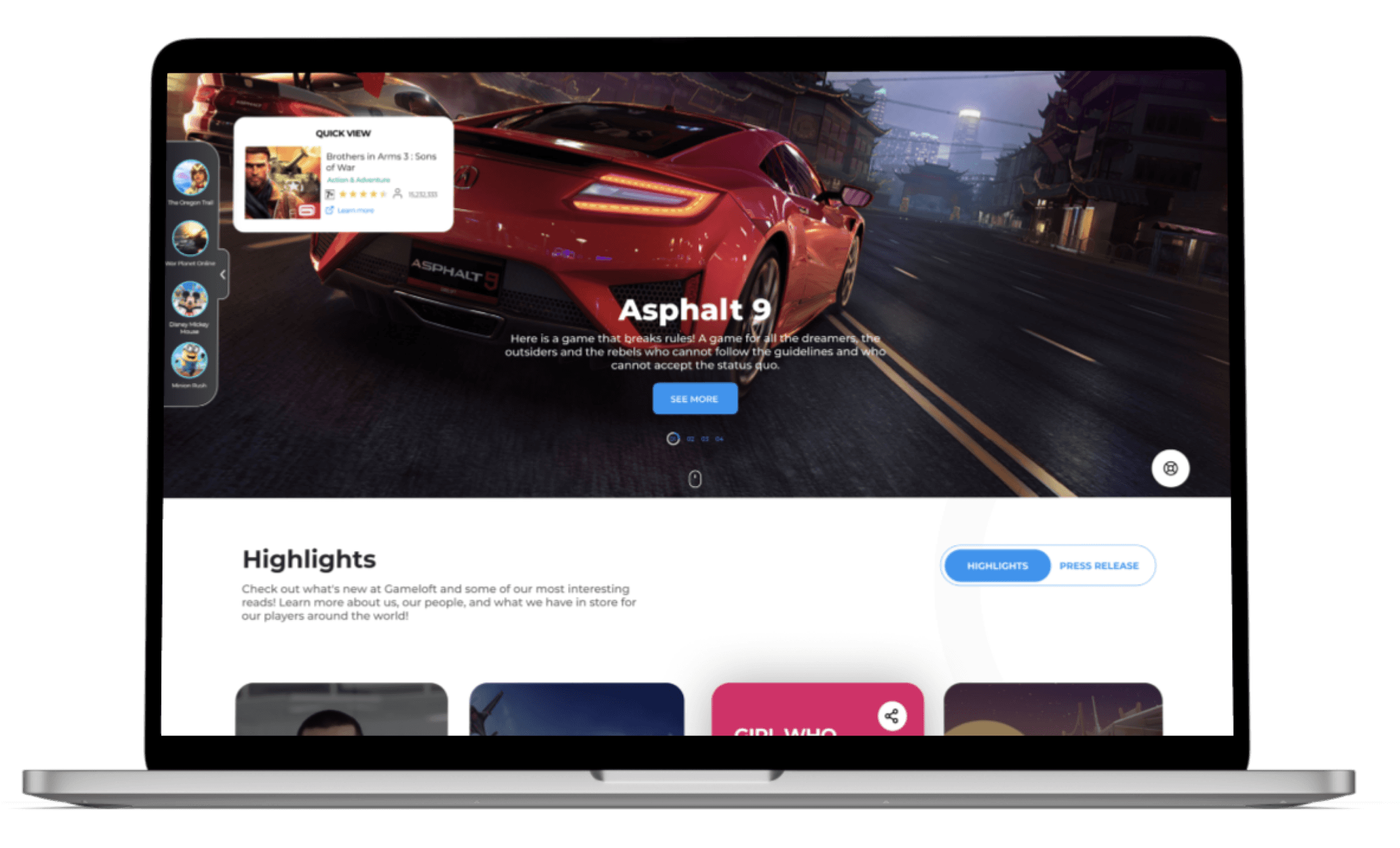
User-Centered Solutions
For gamers, we created an intuitive navigation system and a social media showcase that brought our community to the forefront. For business visitors, we developed a dedicated space that spoke their language and streamlined the partnership process.
User-Centered Solutions
For gamers, we created an intuitive navigation system and a social media showcase that brought our community to the forefront. For business visitors, we developed a dedicated space that spoke their language and streamlined the partnership process.
User-Centered Solutions
For gamers, we created an intuitive navigation system and a social media showcase that brought our community to the forefront. For business visitors, we developed a dedicated space that spoke their language and streamlined the partnership process.
User-Centered Solutions
For gamers, we created an intuitive navigation system and a social media showcase that brought our community to the forefront. For business visitors, we developed a dedicated space that spoke their language and streamlined the partnership process.
User-Centered Solutions
For gamers, we created an intuitive navigation system and a social media showcase that brought our community to the forefront. For business visitors, we developed a dedicated space that spoke their language and streamlined the partnership process.
User-Centered Solutions
For gamers, we created an intuitive navigation system and a social media showcase that brought our community to the forefront. For business visitors, we developed a dedicated space that spoke their language and streamlined the partnership process.
Some key features built for users
Some key features built for users

Designed for Users
As I have two personas in the queue and both having different objective. One is a casual visitor and other is business visitors who wants to collaborate with the Gameloft. I need to equally defined the values for both. So, after the mutiple one-on-one and brainstoming I come to the solution that fullfill both users needs.

Designed Features
To enhance the experience for casual visitors, I made the navigation simpler. To increase engagement, we added a wall showcasing our social media channels on the website. Additionally, we created a section similar to the Play Store where all related products are displayed. For business users, there is a separate area that focuses on their specific needs.
Impact and Success Metrics
+1.5 million visitors in 4 months
We've analyzed website traffic data and observed a 15% increase in overall traffic and a 45% improvement in user retention
Enhanced by A|B Testing and data driven insights
Through A/B testing and user feedback analysis, however, some design decisions had less impact and were addressed in the next iteration of the website.
Received award Hall of Fame
My UX team has been recognized with a Hall of Fame first award as the best project and I was awarded as a best player in 2022.
Recognition
Being awarded the Hall of Fame first award and recognized as the best player in 2022 was humbling, but the real reward was seeing users engage with the platform in ways that weren't possible before. We didn't just update a website; we redefined how Gameloft connects with its community.
While I'm bound by NDA from sharing specific design details, this project stands as a testament to the power of user-centered design in transforming a digital presence. It's a reminder that good design isn't just about aesthetics - it's about creating meaningful connections between a brand and its audience.